Wednesday 28 August 2013

One Kemble Street: The Sixties Space House


When in London last week, I turned off the Aldwych into Kingsway and caught a glimpse of this familiar building. I knew it from the nineties, when I was attending an evening class in the area at CityLit.


Completed in 1966 One Kemble Street used to be called the Space House and was designed by Richard Seifert, whose buildings included hotels, railways stations and office blocks. He was known for his 1960s and 1970s designs and for having been a big influence on London architecture during that period. According to scryscrapernews.com Seifert “originally designed the building to be a proper tower almost twice as high that would have served as a luxury hotel, but objections from Camden Council saw it reduced in height to what has been built today.” I actually like its stubbiness and don’t think doubling its height would have added anything to its aesthetic.


While Seifert is most famous for Centrepoint (which I also like), and the Natwest Tower, now called Tower 42 (my favourite London building), there is something about the smallness of the Space House that makes it more subtle and less ‘grand’ than the other two buildings. It’s like the difference between a sinewy Greyhound and a stocky Corgi. Both are lovely, and you wouldn’t reject the Corgi simply because it is small.


Relates blogs:
The Sound of the Sixties: Brutalist Architecture

Thursday 15 August 2013

Negotiating Brutalist Space at the University of Leeds (part 2)

Inside, Outside, Upside, Upshot


This is part 2 of a psychogeographical blog on the E C Stoner Building at the University of Leeds. For part 1, please click here: Stoner, Stoned, Stonest

The room numbering on each floor are all categorised by type (see the third image below). For example, Level 8 has “Teaching Rooms” and “Teaching Laboratories” amongst other types of rooms. Within these categories the main room use is listed, alongside the number of that room, which is the floor number followed by a full-stop, then the number of the room itself, for instance 8.51 is “Physics and Astronomy Enquiries”. Each room then has an arrow next to it pointing in the direction it is. However, one might ask why there are some rooms on Level 8 that begin with the prefix ‘9’, which denotes a Level 9 room. It then becomes apparent, that the up arrow next to these ‘9’ prefixed numbers means upstairs to the next level (I am not convinced that without knowing the logic of the prefix number, as a visitor would not, that I would understand that I need to go up a level).


If you are already familiar with the way that the different geographical land height was dealt with by the architects Chamberlin, Powell and Bon (CPB) then a lift that only goes from floors 7 to 11 might not be too much of a surprise (see the first image above). However, what does make this idea complicated is that as a user of the campus, one is never exactly sure what level one is on, because the actual ground level is different in different parts of the campus. Therefore, while the entrance level in E C Stoner is level 7, the actual ground level is level 6, because on each of the entrances to the building you take stairs up before you enter it (I took this photo at a part of the building where level 6 was not accessible by that particular lift). However, in, say, the Edward Boyle Library, ground level (and entrance level) is level 9, because it is on higher ground. While this may have seemed like a logical approach by CPB, especially because of the use of walkways linking all these spaces together and making them appear seamless, it does require an explanation from someone ‘in the know’ to actually understand the complex logic.


This plan shows the colours that reflect the height of the ground, the steepest moving toward the North-West edge of the campus. The colours were translated into storey levels and used to help students and staff navigate the campus. This is an image from the Development Plan by the architects.

CPB also attached colours to each level in the buildings (see above). This colour-coding system was used in the Development Plans and also extended to the signs around the campus which appeared on signposts, corridor floors and on the outside of buildings as small coloured square plaques (Occasionally these small plaques can be seen around campus today, although most of them are gone). A large section of the 1963 plan covers this use of colour-coding by level. CPB explain that there was a “difference of 216 feet in elevation between the highest level within existing buildings on Woodhouse Lane […] and the ground level near the convergence of Clarendon Road and the Ring Road” (1963) They are referring to the difference in height between the Northern and Southern borders of the university and go on to explain in details the benefit of applying colour-coding to an area with the equivalent of eighteen storeys, summarising by saying “In a nutshell, the colour identification is intended as an aid to understanding the position of places in three dimensions instead of two” (ibid.).


Nevertheless, I would argue that people moving about the campus generally see that space as being three-dimensional rather than two, and it is only when space is collapsed into a representation in the form of a map or plan, that two-dimension becomes the ‘normal’ view of space. While I think the motive behind the colour-coding and unintuitive level numbering was probably one of being considerate to the user of that space, I am not convinced that the complex spatial ordering of the minds of the architects translated very well into to the use of campus space for those concerned, in this regard at least.

It is at times like these that urban planners and architects could do well to employ psychogeographers!

Other University of Leeds architecture-related blogs:
The Psychogeography of Other Spaces
Emotionally Mapping the Campus

Wednesday 7 August 2013

Negotiating Brutalist Space at the University of Leeds (part 1)

Stone, Stoner, Stonest


The E C Stoner Building at the University of Leeds was named after Edmund Clifton Stoner (1899-1968) who was a theoretical physicist and taught at the University. The building holds a blue plaque which is dedicated to him. An archive of his paperwork is held in the university library. Stoner left the university in 1963.

Surprisingly, the 1960 and 1963 campus Development Plans of Chamberlin, Powell and Bon do not include a section solely dedicated to this largest teaching block on the campus, even though there are provisions for it in the 1960 plan. Built in 1962, at that time the E C Stoner Building had the longest corridor in Europe (as part of what the university calls the Red Route), at over a fifth of a mile long. It became known as ‘Physics/Admin’ in the 1960s, but now tends to be called ‘E C Stoner’ or just ‘Stoner’. The building received Grade II listed status in 2010 and still houses the Physics Department and administrative facilities, alongside Computing and some offices for other departments.


Above is a section of a photograph of the architect’s model of the campus. The E. C. Stoner Building is the long narrow building that can be seen extending from the far left of the image.

Like many of the glass and concrete Brutalist buildings, the E C Stoner Building tends to polarise people. Appearing in the 1960 plan as one of many low-rise long buildings, in actual space it appears much longer than it looks on the plan above. Described by Owen Hatherley as “the aesthetics of hell” he places Brutalism within a long history going back to 18C urban Britain based on how industrialisation subjected workers bodies to the factories and foundries that hired them. (2008: 19-20) Citing the Barbican of Chamberlin, Powell and Bon (CPB), and also the architects the Smithsons who apparently coined the term ‘brutalist’ (and also designed other educational spaces), Hatherley describes the paradox of Brutalism as “the everyday style for the use of the proletariat […] and at the same time creat[ing] avant garde shock images” (2008: 31).


E C Stoner has multiple entrances and an underpass which allows vehicles to move about the space uninterrupted. The two main entrances are from either a large set of steps on the South or a gradual ramp on the North. On the South side is a large open gravelled space with trees and bike stands. This open area has the potential to be used as a piazza, rather than a short-cut to the sports centre. It might be the surface area that discourages congregation - a mixture of sand and gravel which is very dusty and not pleasant underfoot.

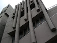
To appreciate its length and size the building is best viewed from one end (see above). Horizontal lines of concrete separate the lines of glassed windows, which are unbroken in the absence of any vertical lines at all. The building extends into the horizon of one’s view, disappearing into the surrounding cityscape. This is the outward face of the E C Stoner which overlooks the new university sports centre, the hospital and Leeds city itself. Reyner Banham describes both the visual and functional aspect of Brutalist architecture as requiring “that the building should be an immediately apprehensible visual entity; and that the form grasped by the eye should be confirmed by experience of the building in use.” (1955: 358) Outside of any surrounding campus space, the building would look like an office block, not untypical of many built in Britain around the same period, especially in the public sector. The architecture designed at the University of Liverpool by Edwin Maxwell Fry between 1955 and 1960 also has a similar Functionalist office block style aesthetic, even though his buildings there are not Brutalist but Formalist, and use brick rather more than concrete. This Formalist style was considered to reflect some kind of nostalgia for factories and workshops.


The other side of the E C Stoner building is much more utilitarian-looking, with a car park attached to it with more teaching/office space atop the car park. On this side the huge length is lost by the breaking up of the building with the perpendicular car park/office extension, attached by a small glass covered walkway. One, however, does not get the true sense of how the building functions until one enters it. Appearing as a straight-forward and simple structure on the outside, once inside the corridors of the interior you feel closed-in and disoriented, especially once away from any sight of the outside. There are no large open foyers in the very Functionalist interior of the E C Stoner Building, like there are in the Lanchester and Lodge period buildings on the University of Leeds campus, such as the Houldsworth Building which houses engineering, a Beaux-Arts classicist design.

This blog continues with Part 2: Inside, Outside, Upside, Upshot

Other University of Leeds architecture-related blogs:
Deconstructing the Ziff
Space-Age or Quasi-Totalitarianism
The Sound of the Sixties

Bibliography:
Banham, Reyner. 'The New Brutalism', Architectural Review, (1955), 354-361.
Hatherley, Owen. 2008. Militant Modernism (Ropley: Zero Books).